Tuesday, 29 April 2014

Past Project Evaluation - Sequential Imaging


After completing my first project and becoming more accustomed to the work flow of the course I approached the next brief.

Brief 

You will initially develop a range of concepts, brainstorms and creative thinking in your sketchbooks. Remember to clearly annotate your thought processes. You will evaluate your ideas and present them to the group. Your concepts will then be storyboarded clearly outlining your thoughts in a rough form for presentation.
Additional visual imagery will be collated as mood boards to aid communication at this stage at this stage. Once rough sketches are completed you will need to break down the storyboard and time out your sequential images for final presentation. These images and X-Sheets will then be used to produce your animatic and proved informed judgements that will aid in the production of your animation during the next module.
You will need to gather a reference file of images to help you complete this project. Sketches from life may prove invaluable as will your own relevant photographs. You will initially trace out each frame looking at the angle, moods and style required from the script. Storyboarding often requires a simplification of loose line and colour which is referred to as “slick”. It is vital to get your drawing right at the initial tracing stage before continuing onwards.
Your finished b/w images should then be scanned onto the computer to be coloured in Photoshop. Once completed you will present your finished work to the group and evaluate your final work in your sketchbooks.
To complement your storyboards you will develop an animatic using elements from your finished visuals. This will form a concise to evaluate animated elements, camera moves and the length of scenes.

Interpretation

Rather than follow the brief directly, I plan on having the majority of my neater storyboard frames created in Adobe Illustrator. This is due to the fact, I feel a cleaner look would be achieved through this method and would help development proceed at a swifter rate. On top of this, adjustments such as colour scheme and texture are easier to perform for the final animation if changes are made further on in the project.

Initial Thoughts and Ideas

To ensure my ideas were recorded and to show progress, I decided to create 3 scripts. The concept for the scripts comes from my mind map around the word “Circle”.

Cowboy script

The cowboy script works off the relation between the word circle and bullet holes. It could also be linked to all the circular aspects in the animation such as eyes, the end of a cigar, the sun and the barrel of a gun. Symbolically the script represents justice linking into the mind maps note “What goes around comes around”. Due to the fact westerns are so highly stylised, it should be easy to work out the basic shots as so many iconic camera shots were used in traditional westerns. This script roughly works around the overcoming the monster plot type

Gentleman’s duel script

This script works uses the shape of the circle again as bullet holes, but also as the monocle the two duellists are wearing. This script is based around the tragedy plot type as the characters inevitably kill an innocent and fail in achieving their goals.

Robot script

The link between a circle and the robot script is currency, the coins which are fed into the vending machine causing it to vomit. The animation could symbolise greed and the way money is related to power.
I then created some rough storyboards, in order to visualise my potential animations further and to help my peers visualise my animation individually.


After peer reviewing my scripts and storyboards, the story I have decided to follow through with is the robot script. This is due to the fact that this animation can be created in a highly stylised way but without the difficulty that the other scripts would have caused. As this animation takes itself less seriously, the over exaggerated movements will emphasize the cartoony style of the characters helping them become more relatable and likeable to the viewer.

Having now decided on an idea, I decided to further design my characters. As the characters in my animation are all robots, the first logical step forwards is to research iconic robots in popular films.
On my character research page I tried to separate the characters into 3 rows, not very human (bottom), human (middle) and kind of human (top). 


By looking at row 2, I instantly recognised that realistic humanoid robots would not fit into my animation well and that I should use a combination of row 1 and 2 to achieve the characters, which I want.
Most of the robots in row 3 seem to have been designed with a very recognisable shape so the designs I created are all based around the use of basic shapes to help create an easily recognisable character. 


Above are my preferred initial designs which I decided to import into Adobe Illustrator so that the linework is a lot clearer and could be used again digitally. 
After importing the initial designs, I chose the 2 designs on the far left of the sheet and decided to create 3 coloured turnaround view for each character so that I could reuse the imagery in my storyboards and to also help give a better sense of the characters depth.


Happy with these turnarounds, I then decided to test out various textures on the characters to see if it helped create a more aesthetically appealing set of images for the storyboard. 


After completing this task, I feel that I successfully achieve most, if not all of my main personal goals and I am comfortable in the end result of these projects.
Creating my characters in Adobe Illustrator meant that when in came to creating animatics and storyboards, for many of the frames I could just reuse my character turnarounds and modify them slightly. For instance in an over the shoulder shot for the vending machine character, all I would have to do in Illustrator would be to copy and paste the character in, and adjust which objects were closest to the front.

By opening up my scripts and ideas to peer review, the experience helped open my mind to new possibilities and ideas which I had not previously considered and looking back at the scripts, I realised that for the amount of time I had available, the Robot Script was the best option.

With the research into famous robots and by dividing them into 3 categories, It helped me realise the design process behind each style of robot and made me view the design process in a different way to before.

Past Project Evaluation - Cutout Style Animation in Cinema 4D part 1

Cutout Style Animation in Cinema 4D


In short, the brief that I was given asked for me to create a cut-out style animation (South Park, Terry Gilliam) which is normally created in 2D software or in a style of stop motion, In a 3D software creating a technique known as pseudo 3D. 

As this technique was completely new to me, I decided to research the techniques further and look at key practitioners of cut out animation.

Research

Cutout animation is a very traditional style of animation based around using flat, 2D characters, which could be made of paper, fabric, plastic or card.  To give more mobility to the character puppets, hinges were often used to join different segments of a character. Despite this, the animation style is very limited in movement, which gives it a unique style. Because of cut out animation’s success, it has been emulated digitally to help maintain quality and modernize the animation.
A good example of this would be with South Park as the animations started out as traditional cut outs and then proceeded to become digital as time passed and the show became more popular.
In order to further my knowledge of this style, I decided to conduct further research on both digital and traditional cut out animation.

South Park

Trey Parker and Matt Stone’s highly successful animations are a prime example of how cut out animation has advanced with technology. When the show fiest aired in 1997, the pilot was created using cardboard and paper cutout characters and when it was accepted for TV, the animation was changed to a digital style that replicates the original cutout style. The animation was done in the program PowerAnimator to help maintain the animations art style until the animators chose to upgrade to AutoDesk Maya at the beginning of Season 5.

Terry Gilliam - Monty Python and the Holy Grail


Terry Gilliam’s work animating for Monty Python is very influential in the cut out style even the South Park animators have cited Gilliam as an influence in their work. The surrealist styles of the animations mean that there is a vast array of styles to be influenced by and Gilliam’s use of mixed media helped to give more of an idea of which style I wanted to pursue.


Ishu Patel - How Death Came to Earth


This is a 1971 short animation that again uses the strange visual style of cut out animation in a psychedelic, surreal way. The animation is based around an Indian myth and several of Ishu Patel’s animations work around spiritual themes. The use of texture in this animation is especially prevalent adding to the surreal look of the piece.


The Kid Stays in the Picture


The cutout style of animation is used in a far less dramatic way here than other examples and uses the technique to create a sense of depth to still images. The depth and slight movement of the images helps keep the viewers’ attention due to the strange appearance of the animation. The images appear to have been separated into layers and move independently to give this effect, the effect being called the parallax scrolling.

Artists

After I had finished researching a variety of artists and their styles, I found the artists which I thought to be the most relevant to my work and chose to research them further. By doing this, I felt that I might learn new skills applicable to my own work and that by viewing more of the artist’s work that it might help with the creative process of my own work. 


Terry Gilliam


The main thing I liked about Terry Gilliam’s work was the surreal nature of his animations. Surrealism is one of the things I personally believe the cutout style of animation works with the best with. To further compliment this, Gilliam used an array of mixed media assets using everything from old photographs to watercolour paintings.

Despite the strange collection of assets, the animation still moved smoothly and used each asset to give another sense of life to the simulated world. As the majority of his animated career was spent with Monty Python, a lot of his animations work around humour, an aspect I wanted to try to incorporate into my own animation.


Cyriak


Cyriak is another British animator who uses Adobe Photoshop and After Effects to create surreal and pychadelic animations usually featuring celebrities or animals. A lot of Cyriak’s work uses geometry, for example, a cats leg splitting into two legs, then those legs splitting again. By doing this he makes it easy for his animations to escalate quickly and become more surreal. Cyriak’s animation are almost entirely contructed in a photomontage style, either as photos mixed with other assets he has created in photoshop or as video clips mixed together in a similar way.

One of the main things I tried to take from Cyriaks style of animation was the way his animations blend photos and video. For example if a photo asset is unavailable Cyriak creates one from other images. If I was to redo this project, I would like to emulate his use of music and sound as the sound in his animations always seems to be fitting to the visuals.

Animation Script

MAN carrying papers walking down a long dark corridor towards a door. As the MAN reaches the door he closes his eyes and inhales deeply before opening the door. The door opens to a large office room playing loud drum and bass music from huge speakers with several intoxicated people dancing.
MERKEL does not look up from her desk and finished cutting a line of cocaine in the shape of Germany. Just as MERKEL finishes snorting the cocaine she hears a sticky footstep alerting her to the MAN. The MAN extends the papers towards her looking visibly worried and MERKEL snatches them from him. A POLITICIAN finishes a bong on the desk.
MERKEL uses the papers to roll a joint, lights it and blows smoke into the MAN’s face  to his bewilderment and begins dancing wildly. The room begins to fill with smoke and clears to reveal the MAN dancing wildly looking very intoxicated and ill.
Outside the office, a PASSER BY walks past and looks confused about the muffled drum and bass music coming from behind the door. The PASSER BY pauses for a second then shrugs and carries on walking.
The MAN staggers back into a wall, slumping down next to an UNCONSCIOUS MAN and passes out.
The MAN suddenly sits up in bed panting and sweating as if awoken from a bad dream and stares at his door.
The door suddenly bursts open to reveal MERKEL dancing furiously and the room he was previously in.


Illustrator Storyboard and Scene Layout


As the animation only really takes place is two places (the hallway and the office) I created a set layout (left) allowing me to get a better understanding of how the scene will be set in a 3D environment. I think that creating a set layout helped me realise a lot about the production of the animation and made the production of assets and composition in 3D a lot easier. 


Past Project Evaluation - Metamorphosis Animation


This brief involved the creation and production of an animation morphing one image into another in 25 frames. The two images required need to be of an animal morphing into a machine (possibly the machine equivalent of the animal, for example a beaver into a chainsaw).

Initial Ideas


An Elephant > A Fire Engine

This morph consists of the Elephant sucking up water with its trunk and transforming into a Fire Engine Spraying water

A Fennec Fox > A Satellite

This animation uses the Fennec Foxes large ears as the main point of transformation to transform into a satellite.

A Frog > A Zeppelin or Hot Air Balloon

For this metamorphosis, the frog’s vocal sac expands and is used to form the air balloon for a zeppelin or a hot air balloon and the rest of the frog’s body is used to form the undercarriage.

A Duck  > A Hovercraft/Boat

The movement of the duck skimming across the surface of the water as it lands is used to transform into the movement of the hovercraft/boat along the water.
A variant of this theme could be a diving bird turning into a hovercraft or boat as it hits the water. This could work well due to the suspense that builds as the bird approaches the water.

Reference Imagery

To find reference imagery, I looked at Edweard Muybridge’s photographic frames of birds in flight as reference to help the animation look cleaner and more realistic. I tried to use this referencing to make the bird in flight animation appear more like the bird is landing by adjusting the angle of flight and by adjusting the angle of the wings when approaching the water.


Below is the Image I would be using for the Boat, which the bird will transform into. 


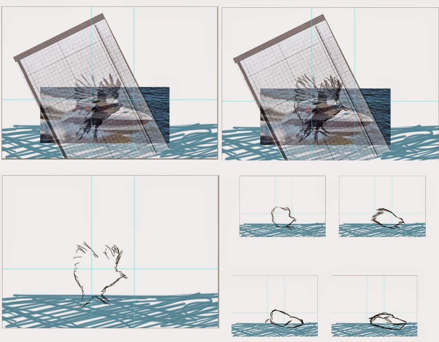
Using Muybridge’s study on bird flight, I isolated each frame to its own layer and used Adobe Photoshop to set up a basic animation.


After this I had to resize the images so that the proportions in the animation would appear correct and so that the position of the photo in the frame, was relative to my animation. I did this by using rulers and by using layer transparency to give a better idea of how to previous frame compared to the more recent one. To check this again, I set the animation to forever so that when more frames were added, a better visualization of the idea was viewable.

The next part of the animation I chose to approach was the basic shape per frame that the morph uses. To do this, I followed a similar approach to the way I had done the frame-by-frame animation of the Woodpecker into a Hand Drill. But instead of using a light box, I instead used the transparency setting in Photoshop


I followed this process for 5 frames to give me a better idea of what the animation would eventually look like and also help me to create a more dynamic and fluid morph.


Next, I approached sketching the Muybridge photo frames.

The approach I took to sketching out the scenes was  quite similar to the approach shown previously regarding transparency.


After the initial rough sketching I decided to add basic colour to give myself a better idea of which parts of the bird/boat would be morphing and where they would morph too. The colour scheme I used to do the basic colouring up came from the main colours used in the boat reference image that I simply sampled with the eyedropper tool and created a basic palette. Due to one of the main colours being white (or at least quite pale) and it being hard to see on the background, I chose to temporarily colour the background red to increase visibility.


After creating a basic colour shape for each scene, I decided to clean up the image, making lines blockier and cleaner but helping to add a stylized feel. The main reason I chose to do this was the constraints on the time I had to produce the animation. However, I liked the look of the basic metamorphosis and I think if I was to produce the animation again I would consider a similar style but with more detail such as basic shadows. To complement the basic style of the metamorphosis,


 I then changed the background to a  neutral, creamy colour to complement the colour of the water and the colour of the bird/boat. I also added very basic water detail behind the boat to give the impression that the boat has some weight on the water.


Past Project Evaluation - Low Polygon Studies

After seeing David O Reilly's work, I became more interested with the low polygon technique and noticed how frequently this technique has been used recently.
Whilst researching Low Polygon artists, I stumbled across some work by Timothy J. Reynolds which creates animal figures in Cinema 4D using a low poly technique. By creating this in Cinema 4D, the lighting and background of the artwork can be adjusted to help give the impression that the objects are made of out origami or are sculpted in real life.


Rather than approaching this technique from a 3D perspective, I initially decided that I would attempt the Low Poly style in Adobe Illustrator so that I might better understand the basics of the style instead of relying on guesswork and so I might use colour to achieve an entirely 2D aesthetic to my low poly work.


After looking at various artwork, I realised that the low polygon style using triangular faces is the style which I think would work best for my work.
I also noticed that the more detail in that part of the artwork, the more triangles were apparent, helping define that shape amongst all of the generally vague shapes.

In Adobe Illustrator, I imported and placed an image of a velociraptor from Jurassic Park as the photo I would be working from.


From here I decided to identify the areas of more detail so that I could remember where needs more shapes. In this instance it was around the Eye and the Mouth of the velociraptor.
Creating a new layer, I was now ready to create the triangular "mesh" over the top of the photo.
Using the pen tool, I created triangles around the edge of the velociraptor so that its shape could be distinguished and created larger triangles where large patches of colour appeared.

With a basic idea of where the detailed areas would need to be, I zoomed in on the eyes and the mouth and repeated this technique on a smaller level, creating a complete "mesh" which now just needed to be coloured.


From this point, I selected each triangle and used the eyedropper tool to select a colour from the photo behind it, ensuring that the colours look fine when placed next to each other and giving an impression of the original image.
Finally to make sure that no points on the image where missed, I gave the piece a coloured background.


With the way I created this piece relying mainly on the basic colouration of the velociraptor, I decided that I would try this same technique on a larger more complex image using smaller triangles to retain the level of detail. For this attempt I used this image of a snarling tiger.


Although creating the "mesh" for this piece was more complex and took significantly more time, the end result was how I had expected it to be and it proved that the method I used was solid.


The colouring up on this piece also took significantly more time as coordinating the colours was more difficult due to the fact there was more variation and some of the detailed areas were out of focus in the photo. If I was to redo a piece of work like this, I would make sure that all parts of the photo were in focus.


After creating this tiger image, I realised that if the image was brought into a software such as Adobe  Photoshop, I could adjust the Hue/Saturation of the image to get a variety of colours which would be incredibly difficult to create in my normal method.


Wednesday, 23 April 2014

Year Evaluation


Having completed my first year at Newcastle College doing an FdA in Animation and Illustration I have done several modules to help further my development in many forms of media.

Joining the course a few weeks into the first module, I learnt the 12 basic principles of animation introduced through Disney’s book the illusion of life. I had previously come across these techniques while researching animation techniques myself, although I think actually having the time to practice these techniques, even briefly, helped me understand the way 2D animation works.

Shortly after this project, I was set a task to produce a loop for the LoopdeLoop website’s brief of Hallucination. Feeling behind on work and missing information from the first few weeks, I asked other class members for help learning about things such as walk cycles and the hallucination project which helped significantly with my design process. To begin with I spent a lot of time storyboarding ideas on one piece of paper as this method of planning helped me visualise how the animation would move without having to commit to other methods which I did not yet know. Despite the overall speed of this method, many of my ideas contained excessive frames for little movement and demanded more detail although most designs were not aesthetically pleasing and would not make sense on their own visually and required annotation.

While I was creating the animation I felt pressed for time and the actual style and feel of the animation is significantly lacking as I didn’t do any research into particular animation styles or artists. By not researching artists or the techniques previously, the animation is quite sketchy and in the time available I could have created something significantly more stylised.

The next module was how to approach the sequential imaging side of animation and helped me to understand a lot about how the original idea will be changed significantly in these stages. The idea I originally wanted to pursue ended up being rejected in favour of another idea after I created rough storyboards, helping me to realise all the flaws in my concept. During this phase I also learnt how to use Adobe Illustrator to a greater advantage compared to previous experiences. During my free time I also experimented with Illustrator more and it has since become one of my favoured creative tools.

This module I felt went well and I was happy with the assets I produced for the storyboards and the process itself moving from concept to script, through a character design stage and then creating the storyboards. If I was doing this project again for a company, I would produce a few variations of scenes in the storyboard so that peer review can decide which scenes best help represent the idea to help create the most concrete representation of my idea.

The next project I participated in was the production of a short animation displaying my attempts at pseudo 3D animation (a technique replicating traditional cut-out animation in a 3D software) in Maxon Cinema 4D. While I enjoyed the conceptual stages and the experience of using new software, the style of animation did not particularly interest me and I feel that my ideas were overly ambitious to try and improve my enjoyment of the module.

Whilst creating the animation, I encountered numerous problems not only with the software at home but also at college effectively crippling my workflow and halting all of my progress. Initially I tried to work around the problem but the progress that was made was of poor quality and deterred me from the work significantly. Eventually I managed to locate a solution to the problem but this a day or two before the deadline and I effectively failed at this project.

From this experience I learnt that I should research in advance the software and trial it myself so that any of these issue could be resolved in a less important time. On the positive side I learnt about many useful tools and settings such as cartoon shaders in Cinema 4D that will help shape several future ideas and the excessive repetition has made me familiar with the software and how I like to work in it.

Throughout the course, I believe that this stage was the hardest but has helped me consider my workflow in a more critical light forcing me to become more organised in regards to work layout in software, folder management and time management. Despite this improvement, in my free time I hope to create a more rigid work pattern, maybe creating a premade template for my research and development work or set stages on how I will approach the production in the future.

Following this project, I started work on modelling and rigging a character in Cinema 4D. Following my newfound organisational methods for this software, I found the production and basic rigging of the character surprisingly simple only struggling with complex sections such as the foot roll sliders which were produced using the Xpresso Tag which I had researched before I had started 3D modelling.


Overall, I have found the year highly education and enjoyable helping me consider my future a lot more. Next year I intend on working heavily with 3D software as the versatility of the medium and its frequent occurrence in the art world makes me sure that it will still be used and evolve through the years I will hopefully be functioning in the industry. One of the things I have enjoyed the most about the course was the way I was taken out of my comfort zone and learnt to experience software at my own pace depending on what I was interested in and what was I wanted to make relevant to my project. As I progressed through the year I made huge changes to the way that I approach organisation and eventually I hope to be able to balance work projects with recreational projects and free time.

Tuesday, 15 April 2014

Past Project Evaluation - LoopdeLoop Hallucination Animation


With this project being my first project on this course and also my first attempt at 2D Animation, I think it is a good idea to look back upon my past work quite critically so that my progress in artwork and project management is more noticeable to myself and to my peers.

To begin with, I created a mindmap with the word "Hallucination" in the centre and worked from that point onwards to help generate my initial concepts.

From this point, I made very rough storyboard sketches and typed out my initial thoughts on the brief and concepts in a Word document as quoted

Initial Thoughts and Ideas

Initially when I think of a looped animation, I think of a walk cycle however, this does not really incorporate a narrative structure and I feel I should take advantage of the brief mentioning that it could be “As creative as you like”.  Taking into consideration the task at hand however, overcomplicating a loop increases the margin for error and makes the work significantly more difficult without necessarily improving the end product.

Ideas

Squid Idea

The animation opens with a close up shot of an eye. The pupil of the eye dilates and the camera zooms in on the black, filling the screen. As the shot fades from black, the view changes to what the eye is seeing, in this instance a city scene but appearing underwater. After a few fish swim past, a giant squid floats into shot, gets scared and shoots across the screen leaving behind ink. The ink squirt grows and makes the screen black, the shot then zooms back out and the black was the pupil making the animation come full circle.

School Idea

The animation shows a boy at school falling asleep in a boring lesson on his desk. The animation then cuts to the boy’s nightmare of him falling down a large well with sharks at the bottom. As the boy hits the water, the shot changes to the boy’s face screaming and a few shots of him pushing himself away from the desk in fright. The animation then returns to the original start frame and the boy starts falling asleep again.

Waving Idea

In the centre of the animation there is a man at a music festival swaying with his arms in the air from side to side. The swaying gets progressively more intense until the man is flopping from side to side unnaturally with his feet still firmly planted. After the animation has reached its peak of intensity the man slows down until he has reached the original state of movement.

Shadow Idea

The animation shows a man standing in front of a dirty brick wall with a long shadow projected behind him to one side. The light source moves past making the shadow switch sides and as the shadow on the wall nears the man, it transforms into a sinister figure reaching towards to man. The light source then switches back to the original side and as the shadow figure returns, it reaches towards the man again. This returns the animation to its original place.

Sky Idea

This animation consists of a man on a hill staring up at the sky and wherever he turns his head, a hexagonal mesh appears. As his head turns, the mesh fades and highlights where he is looking. Behind the mesh the stars twinkle consistently adding a layer of depth to the animation.

Television Idea

This animation idea is from a first person perspective of sitting and watching a television flicking through the channels. After a certain number of channel changes, a channel with the person on the chair appears as though they are being watched through the television or like they are the channel. After briefly watching themselves, the person on the screen and the person sitting in the chair skip past the channel returning to the start of the animation.

Sneezing Idea

This is a very basic idea of a man sneezing and as he sneezes he becomes more pixelated. When he inhales after the sneeze, he then becomes less pixelated and returns to the beginning of the animation.

Waving arms Idea

This idea consists of having a delayed blur behind the movement of an object in shot, for instance an arm swaying but having several arms following it in varying opacity. This will hopefully give the illusion that time is slowing down.


Following peer reviews and further research, I decided that I would follow the "Squid Idea" as it became apparent that this was the idea which I had the most vivid ideas for and this would help with the production process.

At this point I was new to the course and as I had previously used Adobe Photoshop I thought it best to produce my animation inside this program. I feel this was a wise decision as the burden of starting a new course and learning a new software could have been overwhelming and affected the quality of work.

The screenshots below give an indication of how the final animation looked, However the coloured guides were used to help me get a better idea of what will be visible in the render and did not appear in the final product.

If I was to Redo this project I would research into a 2D style more giving my animation more of a stylised look as when I created this animation I was still unsure about how it would look. Ideally I would create a blockier artistic appearance and remove all the linework as I feel that this makes the animation appear messy and rushed (which to some extent it was, due to my late joining on the course).

Despite the appearance of the end product, I think that my storyboarding and conceptual stages were approached with care and I the majority of the ideas I came up with could still be used in future projects.


Monday, 14 April 2014

Targets and SWOT - Update 14th April


The past week has been entirely dedicated to producing and editting blog posts for my PPD Blogging Task so there hasnt been much time to progress with my animation. This is the reason that this coming week I will be focusing more on having a final composition for my animation in its current state so that I have an animation to hand in when the deadline comes.

Targets

  • Have a basic rough edit of the kaleidoscope pattern looped in Adobe After Effects
  • Work out a way to include the tree animation by the 17th of April
  • Polish off past analysis for the blog
Strengths

  • Majority of blog work done 
  • Basic 3D animations completed and rendered
  • A lot of free time
Weaknesses
  • Lots of distractions e.g. Nice weather
  • Not many finished animations in my back catalogue
  • No textured animations which I would deem usable meaning I will probably have to redo a lot of work
  • Confused about the Creative CV, Show reel standards and all work in general
Opportunities
  • Need to complete these animation to pass the course
  • Following these deadlines the only work is competition based which gives me the opportunity to earn some money and create animations which are fun to produce
  • A large amount of free time to focus on University and the final show
Threats
  • Extreme lack of motivation due to my choice not to pursue animation further, leaving this work seeming pointless especially the written work about choosing to pursue animation
  • With a lot of unfinished work, I will have to spread my time out across various tasks forcing me to multitask 
  • Returning to past work may be difficult as I will probably have forgotten my work process at the time